We designed and built an online, air quality map as part of a community-based program to monitor air quality using low cost equipment. Working with schools and community partners, the program purchased, installed, and configured 3 Aeroqual Micro Air Quality monitors and 20 PurpleAir particulate matter monitors. The monitors measured air quality in and around Southeast Michigan schools, both inside and outside the buildings. Students were then able to analyze and compare indoor and outdoor air particulate levels at different days and times.
Our role in the project was to build a system to collect and aggregate data from the monitors and display air quality information on an interactive map. The two brands of monitors were very different in how they formatted and delivered data, so the challenge was to stream and present data consistently across both monitor types.
Collecting Data
The sensors collected and reported their readings very differently. Our first task was to pull and aggregate the sensor data into a common format. We created a Drupal module with a service that periodically pulled data from the sensors, transformed and aggregated it into a single data object, and provided a RESTful endpoint to serve the combined data back out in JSON format.
We then created a second Drupal module with a service to pull JSON sensor data from that RESTful endpoint and save it in Drupal entities. Each entity represented a sensor and contained fields for data about the device and its air quality measurements. Drupal entities were updated with sensor data every 5 minutes for a near real-time display.
Finally, we displayed the sensor data from those Drupal entities on an interactive map of Southeast Michigan.
The Map
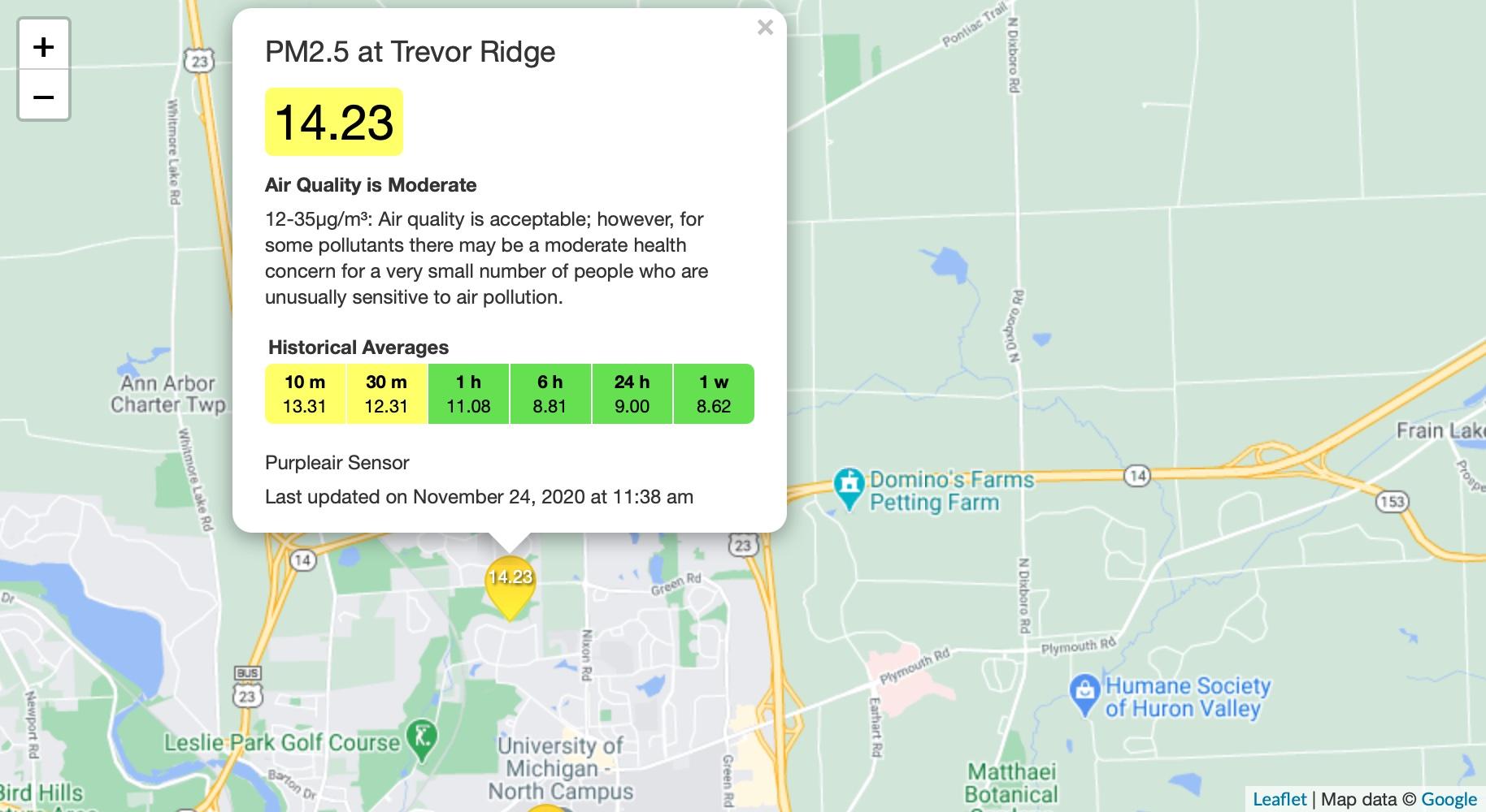
We created an interactive air quality map using the Drupal Leaflet module and Google map data. The map displays a unique marker at each sensor’s location. The air quality index is overlaid on the marker and determines the marker’s color. The colors range from green to dark red with four steps in between. Each step represents a range of air quality indices. A green marker indicates a good air quality index and a dark red marker indicates a poor air quality index.

Sensor Details
Clicking the marker displays detailed information from the sensor. The popup shows the name of the sensor, the current air quality index with a background color to indicate severity, a text description of the air quality, and color-coded historical data averages over 10 minutes to 1 week. The sensor type and last updated date are also shown.
Success
We worked with community partners to create an interactive air quality map of Southeast Michigan. Using the Drupal Leaflet module was a time-saver for creating the map and placing markers. The main challenge on this project was collecting and combining the data from two different brands of air quality monitors. Our solution fit the bill – a pair of web services to import, transform, and populate Drupal entities.
- Drupal
- JavaScript
- Google Maps
- JSON
- RESTful Services
- Photoshop